Industry
B2B SaaS
Client
Design Systems
Building Scalable Foundations for Products and Teams
Overview
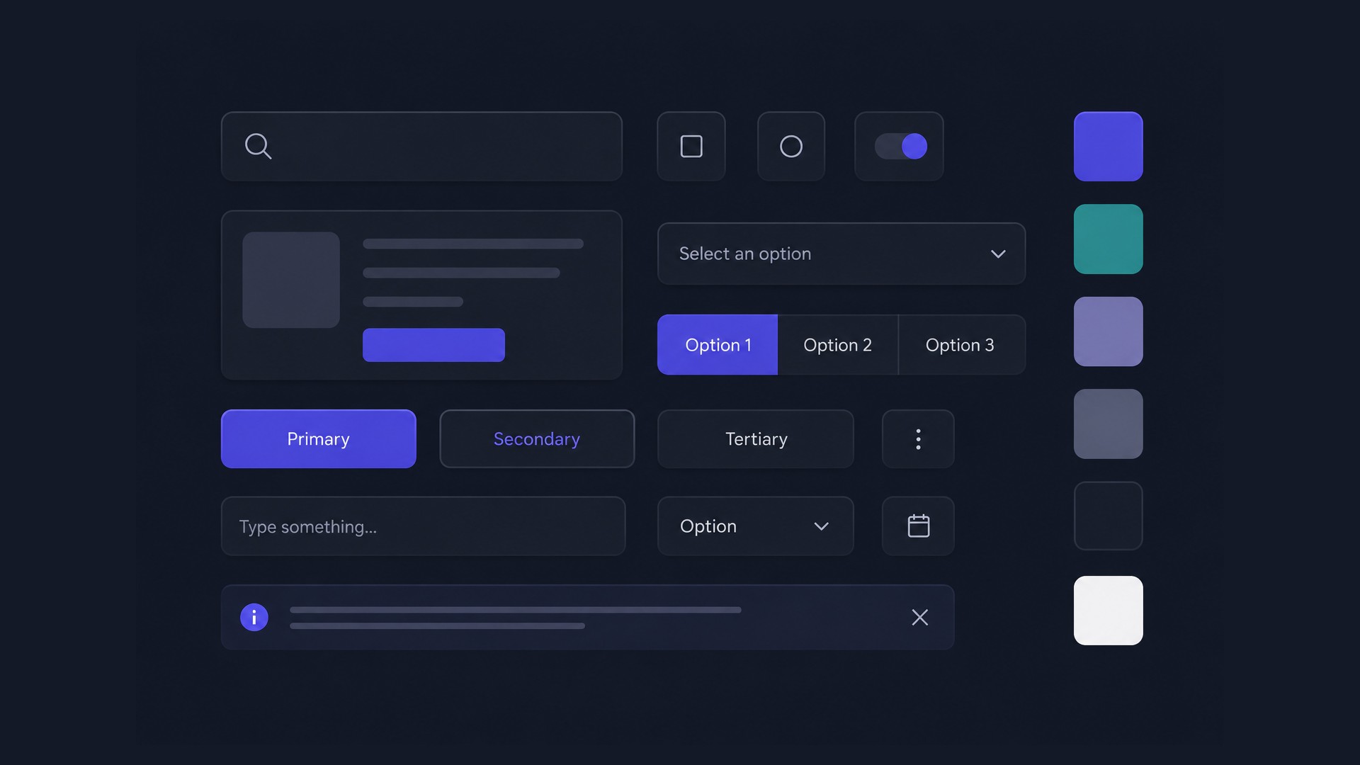
Throughout my career, I’ve approached design systems as products rather than libraries. Their purpose extends far beyond reusable components - they establish the architecture, governance, and shared language that enable organisations to scale consistently. My work spans designing core foundations, defining token strategies, structuring modular libraries, governing component ecosystems, and aligning design with engineering. Whether supporting a growing SaaS platform or an enterprise organisation, the objective remains the same: create systems that teams can trust, extend, and maintain over time.

Foundations
I view foundations as the architectural layer that defines how a design system behaves long before components or patterns are introduced.
Rather than treating colour, typography, spacing, grids, or elevation as isolated styling assets, I structure them as interconnected systems with clearly defined relationships, constraints, and governance.
Well-designed foundations establish a common language shared across design and engineering. They reduce ambiguity, eliminate subjective decisions, and create predictable rules that scale from individual interfaces to entire product ecosystems. This allows teams to focus on solving user problems instead of repeatedly redefining visual behaviour.
Foundations also provide the stability required for higher-order abstractions such as design tokens, reusable components, and contextual patterns. By investing in a robust architectural base, products can evolve, expand into new domains, or support multiple brands without compromising consistency or accumulating unnecessary design debt.
In enterprise environments, the value of foundations extends beyond visual consistency. They enable scalable collaboration, simplify maintenance, accelerate onboarding, and ensure that growth is driven by systematic principles rather than one-off design decisions.
Foundations
I view foundations as the architectural layer that defines how a design system behaves long before components or patterns are introduced.
Rather than treating colour, typography, spacing, grids, or elevation as isolated styling assets, I structure them as interconnected systems with clearly defined relationships, constraints, and governance.
Well-designed foundations establish a common language shared across design and engineering. They reduce ambiguity, eliminate subjective decisions, and create predictable rules that scale from individual interfaces to entire product ecosystems. This allows teams to focus on solving user problems instead of repeatedly redefining visual behaviour.
Foundations also provide the stability required for higher-order abstractions such as design tokens, reusable components, and contextual patterns. By investing in a robust architectural base, products can evolve, expand into new domains, or support multiple brands without compromising consistency or accumulating unnecessary design debt.
In enterprise environments, the value of foundations extends beyond visual consistency. They enable scalable collaboration, simplify maintenance, accelerate onboarding, and ensure that growth is driven by systematic principles rather than one-off design decisions.

Design Tokens
I treat design tokens as the contract between design and engineering rather than a collection of styling variables. Their primary role is to abstract visual decisions into a structured system that can be shared, governed, and evolved independently of individual components or products.
To achieve this, I organise tokens into multiple layers with clearly defined responsibilities. Core tokens contain immutable primitives such as colour scales, spacing values, typography metrics, radii, and elevation levels. Semantic tokens introduce meaning by mapping those primitives to concepts like surfaces, borders, text, or status, allowing products to evolve visually without changing implementation logic. Component tokens then translate semantic decisions into the specific needs of reusable UI elements, ensuring consistency across variants, states, and interaction patterns.
This separation of concerns enables safe and predictable change management. Adjustments made at the foundation level can propagate through semantic mappings into components without requiring widespread manual updates, reducing maintenance costs and minimising the risk of inconsistencies.
In enterprise environments, a well-designed token architecture becomes essential for scaling. It supports theming, white-label solutions, multi-brand ecosystems, accessibility adaptations, and cross-platform development while preserving a single source of truth shared between design and engineering teams.
More importantly, tokens establish an architectural boundary between visual language and implementation. As products, teams, and requirements grow, this layered approach allows systems to evolve incrementally instead of accumulating design debt or relying on duplicated styling decisions.
Design Tokens
I treat design tokens as the contract between design and engineering rather than a collection of styling variables. Their primary role is to abstract visual decisions into a structured system that can be shared, governed, and evolved independently of individual components or products.
To achieve this, I organise tokens into multiple layers with clearly defined responsibilities. Core tokens contain immutable primitives such as colour scales, spacing values, typography metrics, radii, and elevation levels. Semantic tokens introduce meaning by mapping those primitives to concepts like surfaces, borders, text, or status, allowing products to evolve visually without changing implementation logic. Component tokens then translate semantic decisions into the specific needs of reusable UI elements, ensuring consistency across variants, states, and interaction patterns.
This separation of concerns enables safe and predictable change management. Adjustments made at the foundation level can propagate through semantic mappings into components without requiring widespread manual updates, reducing maintenance costs and minimising the risk of inconsistencies.
In enterprise environments, a well-designed token architecture becomes essential for scaling. It supports theming, white-label solutions, multi-brand ecosystems, accessibility adaptations, and cross-platform development while preserving a single source of truth shared between design and engineering teams.
More importantly, tokens establish an architectural boundary between visual language and implementation. As products, teams, and requirements grow, this layered approach allows systems to evolve incrementally instead of accumulating design debt or relying on duplicated styling decisions.

Scaling the System
As organisations grow, a Design System must scale not only in size but also in maintainability, governance, and ease of adoption. A single monolithic library quickly becomes difficult to navigate, slower to maintain, and increasingly challenging for teams working across multiple product domains.
My preferred approach is to establish a lean Core Design System containing shared foundations, token architecture, universal components, and governance principles. Product domains then extend this core through context - specific libraries that inherit the same architectural model while introducing domain - specific components, patterns, templates, and documentation.
This separation creates a clear boundary between shared infrastructure and product - specific implementation. The Core remains focused on consistency and long - term maintainability, while contextual libraries provide the flexibility required to address unique business needs without introducing unnecessary complexity into the shared ecosystem.
Beyond these libraries, teams maintain dedicated production flows that capture real user journeys and business scenarios. Rather than embedding product logic directly into the Design System, production flows compose reusable building blocks into complete experiences tailored to a specific domain. This keeps the system modular, prevents duplication, and allows both the Design System and the products built on top of it to evolve independently.
The result is an architecture that scales with the organisation itself: preserving a single source of truth, improving design tool performance, reducing cognitive load, and enabling multiple teams to contribute simultaneously without compromising consistency or architectural integrity.
Scaling the System
As organisations grow, a Design System must scale not only in size but also in maintainability, governance, and ease of adoption. A single monolithic library quickly becomes difficult to navigate, slower to maintain, and increasingly challenging for teams working across multiple product domains.
My preferred approach is to establish a lean Core Design System containing shared foundations, token architecture, universal components, and governance principles. Product domains then extend this core through context - specific libraries that inherit the same architectural model while introducing domain - specific components, patterns, templates, and documentation.
This separation creates a clear boundary between shared infrastructure and product - specific implementation. The Core remains focused on consistency and long - term maintainability, while contextual libraries provide the flexibility required to address unique business needs without introducing unnecessary complexity into the shared ecosystem.
Beyond these libraries, teams maintain dedicated production flows that capture real user journeys and business scenarios. Rather than embedding product logic directly into the Design System, production flows compose reusable building blocks into complete experiences tailored to a specific domain. This keeps the system modular, prevents duplication, and allows both the Design System and the products built on top of it to evolve independently.
The result is an architecture that scales with the organisation itself: preserving a single source of truth, improving design tool performance, reducing cognitive load, and enabling multiple teams to contribute simultaneously without compromising consistency or architectural integrity.

Components & Patterns
I design components as stable, reusable primitives that encapsulate both visual language and interaction behaviour. Their purpose is not to maximise configurability but to provide clear contracts that promote predictable usage, accessibility, and consistency across products. A well-designed component should solve a recurring problem once, allowing teams to reuse it with confidence rather than reinterpreting it in every feature.
Patterns operate at a higher level of abstraction by combining multiple components into solutions for common product scenarios. Instead of prescribing complete screens, they establish proven structures for workflows such as forms, data tables, filtering, navigation, or communication, enabling teams to assemble complex interfaces without repeatedly solving the same design challenges.
Maintaining a clear distinction between components and patterns is essential for long-term scalability. Components remain focused, composable, and implementation-agnostic, while patterns capture domain knowledge and recommended usage without introducing unnecessary coupling. This separation keeps the system flexible, reduces duplication, and allows both layers to evolve independently as products and organisational needs change.
At scale, this approach improves consistency not by limiting creativity but by eliminating avoidable decisions. Teams spend less time rebuilding familiar interactions and more time addressing the unique problems that differentiate their products.
Components & Patterns
I design components as stable, reusable primitives that encapsulate both visual language and interaction behaviour. Their purpose is not to maximise configurability but to provide clear contracts that promote predictable usage, accessibility, and consistency across products. A well-designed component should solve a recurring problem once, allowing teams to reuse it with confidence rather than reinterpreting it in every feature.
Patterns operate at a higher level of abstraction by combining multiple components into solutions for common product scenarios. Instead of prescribing complete screens, they establish proven structures for workflows such as forms, data tables, filtering, navigation, or communication, enabling teams to assemble complex interfaces without repeatedly solving the same design challenges.
Maintaining a clear distinction between components and patterns is essential for long-term scalability. Components remain focused, composable, and implementation-agnostic, while patterns capture domain knowledge and recommended usage without introducing unnecessary coupling. This separation keeps the system flexible, reduces duplication, and allows both layers to evolve independently as products and organisational needs change.
At scale, this approach improves consistency not by limiting creativity but by eliminating avoidable decisions. Teams spend less time rebuilding familiar interactions and more time addressing the unique problems that differentiate their products.

Governance
A Design System does not remain consistent simply because reusable assets exist. It requires clear governance that defines ownership, establishes quality standards, and ensures that decisions are documented, reviewed, and communicated as the system evolves.
In my approach, governance extends beyond contribution workflows or release processes. It includes maintaining comprehensive documentation for components and patterns, covering their purpose, anatomy, behaviour, variants, interaction logic, usage guidelines, and recommended best practices. This transforms reusable assets into shared organisational knowledge rather than isolated design files.
Well-structured documentation reduces ambiguity, shortens onboarding time, and enables designers and engineers to make informed decisions without relying on tribal knowledge or personal interpretation. It also creates a common language across teams, making collaboration more predictable and reducing the risk of inconsistent implementations.
As organisations scale, governance becomes the mechanism that protects the integrity of the Design System. By combining defined processes with living documentation and continuous maintenance, the system remains understandable, trustworthy, and capable of supporting multiple teams and products over the long term.
Governance
A Design System does not remain consistent simply because reusable assets exist. It requires clear governance that defines ownership, establishes quality standards, and ensures that decisions are documented, reviewed, and communicated as the system evolves.
In my approach, governance extends beyond contribution workflows or release processes. It includes maintaining comprehensive documentation for components and patterns, covering their purpose, anatomy, behaviour, variants, interaction logic, usage guidelines, and recommended best practices. This transforms reusable assets into shared organisational knowledge rather than isolated design files.
Well-structured documentation reduces ambiguity, shortens onboarding time, and enables designers and engineers to make informed decisions without relying on tribal knowledge or personal interpretation. It also creates a common language across teams, making collaboration more predictable and reducing the risk of inconsistent implementations.
As organisations scale, governance becomes the mechanism that protects the integrity of the Design System. By combining defined processes with living documentation and continuous maintenance, the system remains understandable, trustworthy, and capable of supporting multiple teams and products over the long term.

AI-Assisted Workflows
I see AI as an accelerator for Design System operations rather than a replacement for design expertise. Its greatest value lies in reducing repetitive, knowledge-intensive work while allowing designers to focus on architecture, governance, usability, and long-term product thinking.
In my workflow, AI assists with tasks such as structuring documentation, refining naming conventions, analysing system consistency, generating implementation drafts, exploring edge cases, and synthesising research. It also serves as a collaborative thinking partner when evaluating component APIs, scalable architectures, or trade-offs between flexibility and maintainability.
More importantly, I believe Design Systems are evolving into machine-readable knowledge bases that can actively support AI-powered tooling. Well-structured foundations, token hierarchies, reusable components, patterns, and documentation provide the context needed for coding assistants and design agents to generate interfaces that align with established system conventions rather than relying on generic assumptions.
As platforms such as Claude Code, Claude Design, and Figma AI continue to mature, the quality of AI-generated output will increasingly depend on the quality of the underlying Design System. In that sense, investing in documentation, governance, and architectural clarity is no longer just about improving collaboration between designers and engineers, it is also about creating reliable context for the next generation of AI-assisted product development.
AI-Assisted Workflows
I see AI as an accelerator for Design System operations rather than a replacement for design expertise. Its greatest value lies in reducing repetitive, knowledge-intensive work while allowing designers to focus on architecture, governance, usability, and long-term product thinking.
In my workflow, AI assists with tasks such as structuring documentation, refining naming conventions, analysing system consistency, generating implementation drafts, exploring edge cases, and synthesising research. It also serves as a collaborative thinking partner when evaluating component APIs, scalable architectures, or trade-offs between flexibility and maintainability.
More importantly, I believe Design Systems are evolving into machine-readable knowledge bases that can actively support AI-powered tooling. Well-structured foundations, token hierarchies, reusable components, patterns, and documentation provide the context needed for coding assistants and design agents to generate interfaces that align with established system conventions rather than relying on generic assumptions.
As platforms such as Claude Code, Claude Design, and Figma AI continue to mature, the quality of AI-generated output will increasingly depend on the quality of the underlying Design System. In that sense, investing in documentation, governance, and architectural clarity is no longer just about improving collaboration between designers and engineers, it is also about creating reliable context for the next generation of AI-assisted product development.
